
Branded Spaces
Storytelling
Digital/Social
hello there
Waterfront Blues Festival Rebrand & Launch Case Study
Role: Graphic Designer
Agency: Happylucky
Challenge
The Waterfront Blues Festival, an iconic four-day music festival in Portland, Oregon, wanted a new brand identity and a marketing campaign for their 35th Anniversary festival in 2022 to be executed across all social platforms to drive awareness and excitement for the festival’s post-Covid, in-person return. The festival features performances by local and international blues, soul, funk, and R&B musicians. Founded in 1988, it garners international acclaim and has raised over $10 million dollars for local community organizations.
The new visuals would need to unite bold colors and soulful typography to embody the storytelling spirit and vibrance the Blues brings to the world. How do we connect a new audience with the existing fanbase through a vibrant color palette and organic shapes that emulate its connection to music and community?
Solution
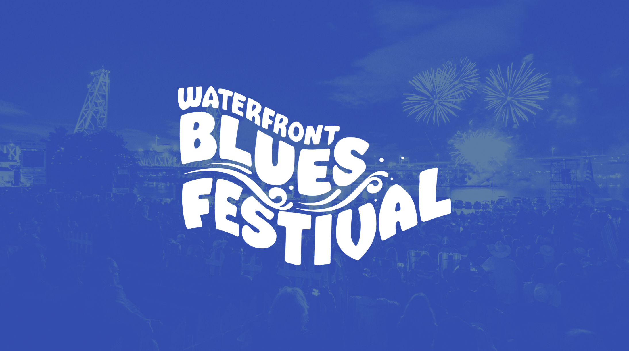
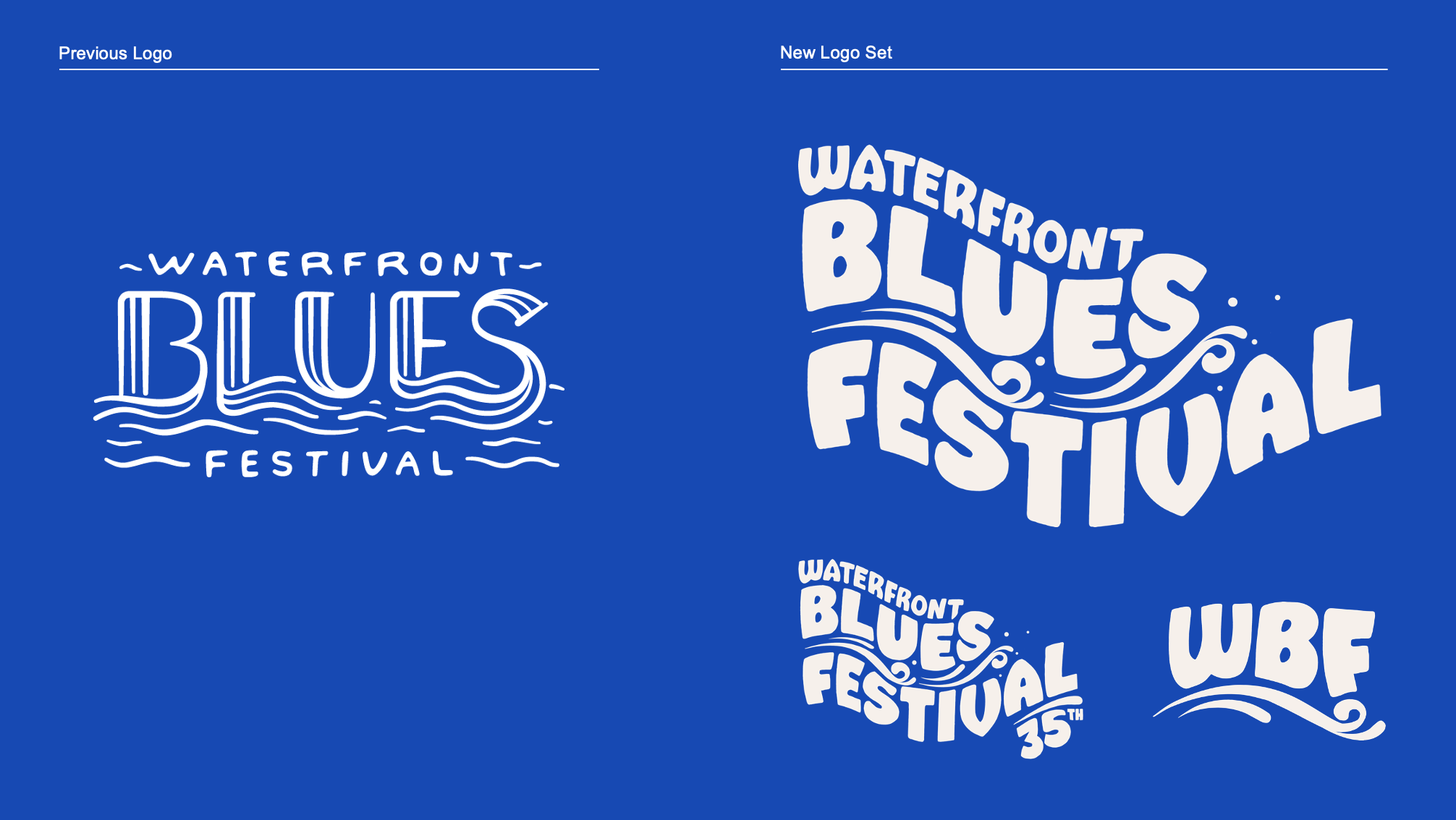
An evergreen brand identity that unifies the beloved elements of the festival: community, water and dance. Using strong messaging and strategy we expanded on the idea of the Blues being about community, togetherness, feeling, nourishment, and more. From a website revamp to posters to stage set designs to social media and a new logo, we created an updated visual language that represents the vibrancy of the festival.


Approach
The design team collaborated with the organization to define what the Waterfront Blue Festival legacy has been and what they see for its future. We wanted to understand who their audience was, what their experience with the festival had been and how to connect a wider audience to the events while keeping messaging in brand with community building. After interviewing a variety of annual attendees we took their responses to help create the updated messaging of the festival. The resounding feeling and experience of the Blues was more than just music but also community, togetherness, feeling, nourishment, and more.
We took our findings and created new messaging and several rounds of designs with an updated color palette and shapes to reflect the vibrancy and excitement of the festival. Creating a flexible headline system, “[Blank] is the Blues,” working in parallel with photography, could be tailored to the media placement in order to maximize storytelling and impact. From new logos to a website revamp to posters to stage set designs to social media, the team brought to life the emotional framework that makes up the Blues through an updated and more iconic visual language.


